
PagBank
About
Payment Link — helping small sellers get paid without a website.
Year
2020-2021
timeline
10 months
What I did
UX / Interface Design, Prototyping, Design Strategy, Motion
Team
Product Manager, Mobile Engineers, Backend Engineer
the result
+89% Total Payment Volume (TPV) +69% of sellers making at least one sale via Payment Link +67% increase in transactions processed
The Problem
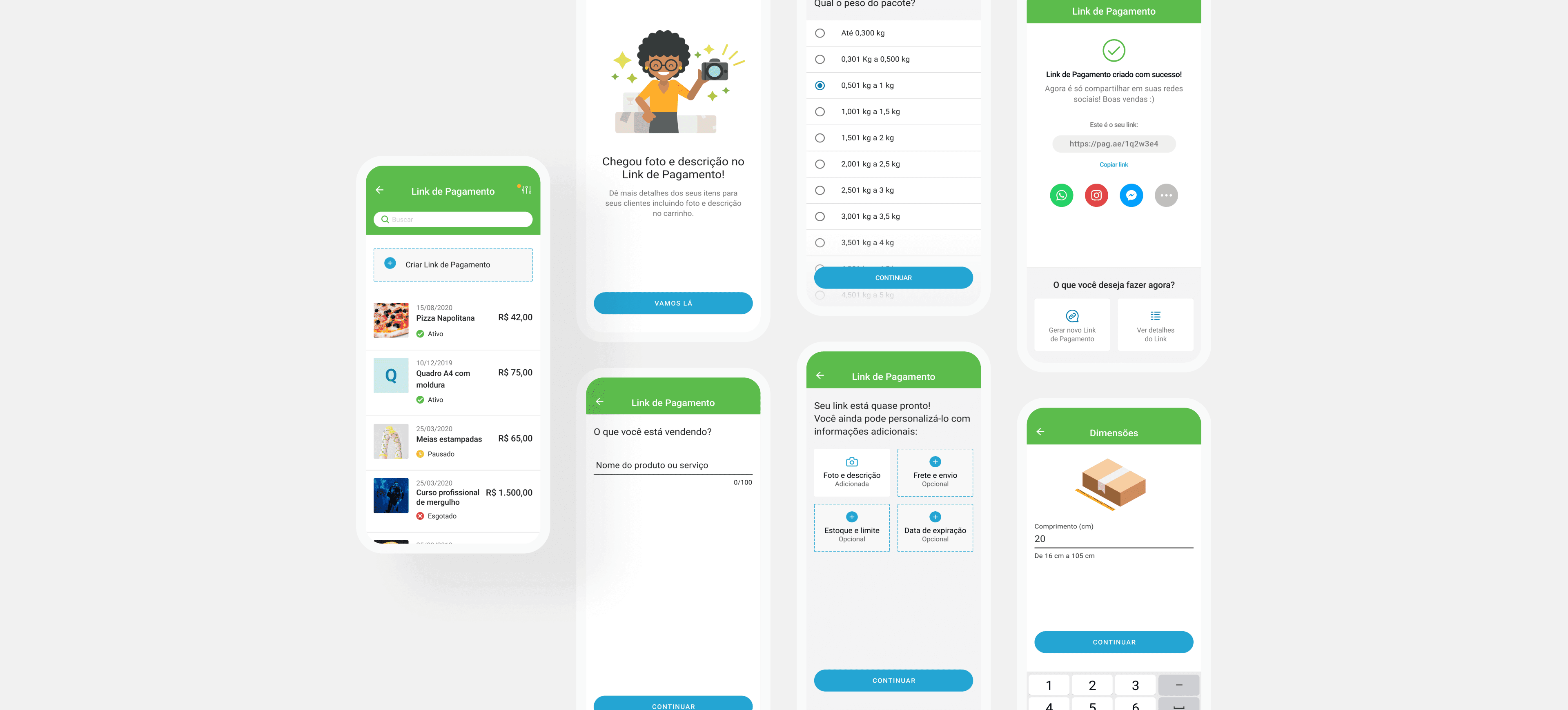
Payment Link let sellers with no website and no POS system sell online — just share a link, get paid instantly. It had a large, loyal user base, but the product hadn't evolved in years. Competitors like Mercado Pago, Stone, and SumUp had shipped features PagBank's users didn't have, and the company was quietly losing revenue and market share as a result.

My Role
I was a core contributor on a cross-functional squad — PM, UX researcher, two mobile engineers, and a backend engineer — driving interface direction, prototyping, and usability testing, while research design and synthesis were shared closely with our researcher.

How I approached it
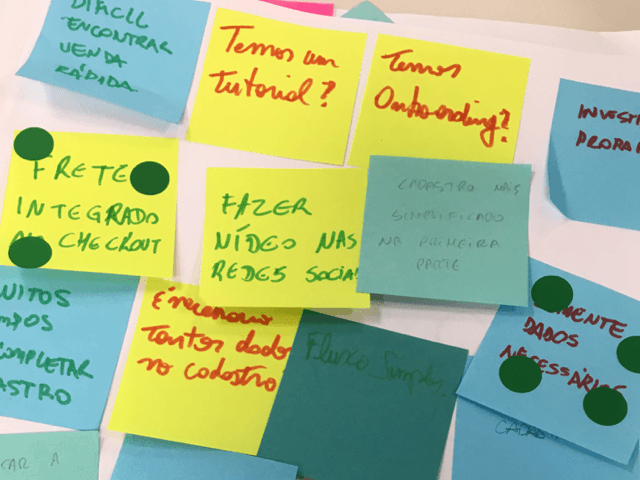
Competitor analysis → Benchmarked Mercado Pago, Stone, and SumUp to identify the feature gap and understand where PagBank was falling behind User research → Surfaced three distinct user segments, from self-employed sellers to small businesses to in-person sellers who hadn't adopted Payment Link at all yet Feature validation survey → Asked our own user base to rank which new features they wanted most: photos & descriptions, shipping calculation, and stock/limit control Explored two UX directions → One that folded new features directly into the core flow, one that kept them optional add-ons — then tested both with 12 users in moderated sessions at PagSeguro's UX lab Users picked the flexible option → The direction with optional features won clearly, since it let each seller type include only what mattered to their business Adapted under pressure → When COVID-19 hit mid-project, we reprioritized and shipped a streamlined version of the new flow first, to support the wave of informal Brazilian sellers who suddenly needed a fast way to sell online

What we validated
Before the full rollout, we A/B tested the original 2-step flow against a new 3-step version that added the optional Customization step that users requested. → Before: 78.1% conversion, 21.9% drop-off → After: 79.1% conversion, drop-off down to 16.2% — despite the extra step Adding a step could easily have hurt conversion. Instead, drop-off fell ~26%, and overall conversion still ticked up. Users weren't abandoning a longer flow — they were engaging more because it gave them something they'd asked for, which gave the team confidence to ship broadly.


What shipped
→ Streamlined core user flow → Photo & description support → Shipping calculation → Stock and limit control

Outcome
The redesign drove an 89% increase in Total Payment Volume, a 69% rise in sellers actively using Payment Link, and 67% growth in transactions — dramatically beating the original 6% TPV target set at the project's outset.
More works

